WeAudit TAIGA
Redesigning the forum and engagement features of TAIGA - a crowdsourced platform for auditing AI-generated images for bias - to increase user participation and make audit contributions more meaningful.
Crowdsourcing AI fairness - and making it worth participating in.
WeAudit is a platform that harnesses the crowd to improve machine learning and algorithmic fairness. TAIGA (Tool for Auditing Images Generated by AI) is one of its core tools - users explore AI-generated image prompts, write audit reports on the biases they observe, and share their findings in a community forum.
The three-step flow - Explore Prompts → Author an audit report → Share and discuss - is simple. But participation was uneven and the forum lacked the engagement features needed to sustain a community around bias auditing. Our work focused on understanding who was participating, what they needed, and redesigning the platform to support broader, more sustained engagement.
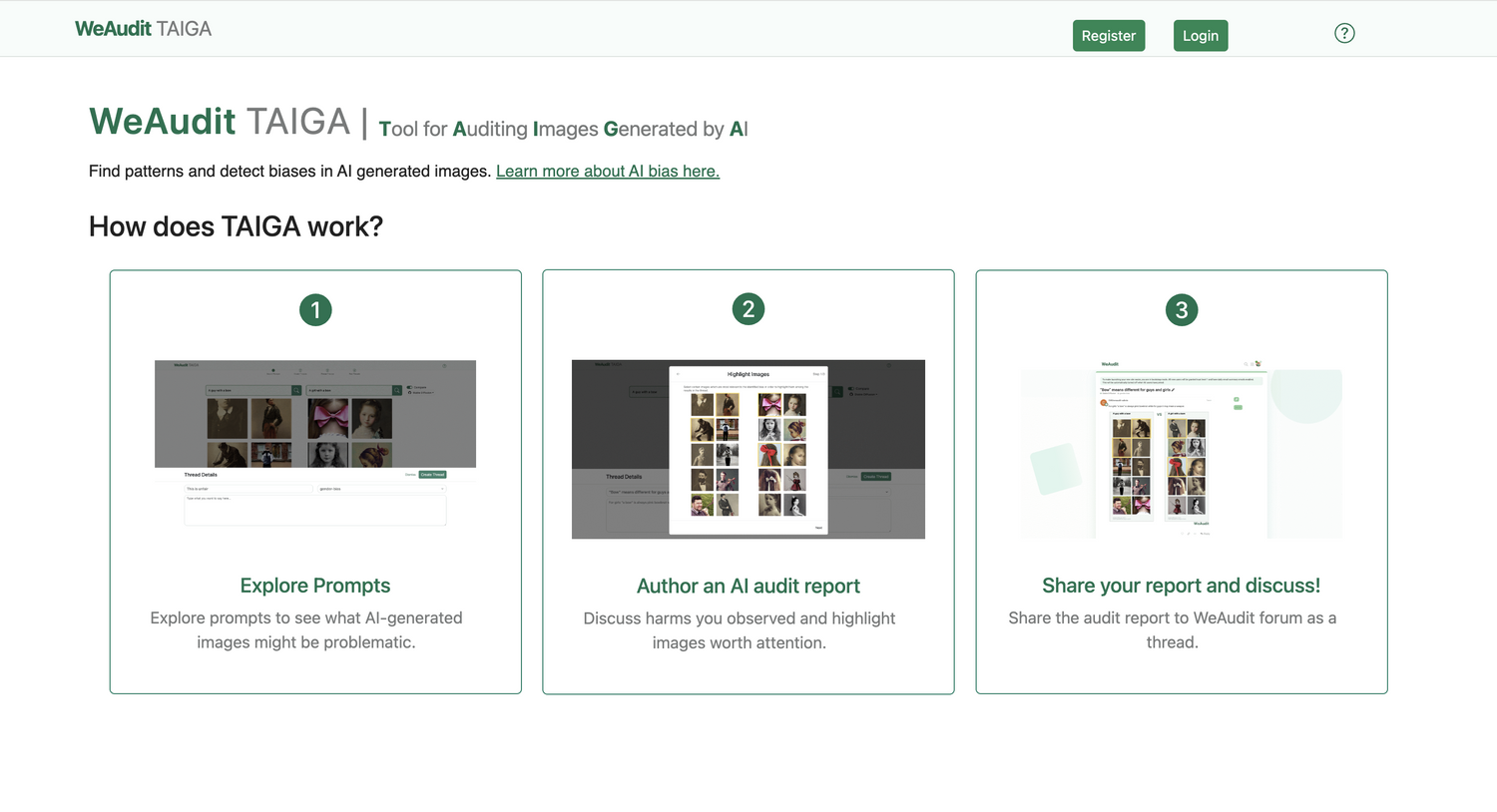
TAIGA: Explore prompts → Author an AI audit report → Share your report and discuss.
Who participates, and what shapes their perception of bias?
We analyzed survey data from existing TAIGA users to understand how gender, familiarity with algorithmic systems, and bias category affected how people perceived and rated AI-generated images.
Finding 01 - Gender shapes harm perception
Males were significantly more likely to rate AI-generated images as not harmful. Females and LGBTQ+ participants were more likely to rate the same images as harmful - a consistent gap that suggests the auditing crowd's composition directly affects what gets flagged as a problem.
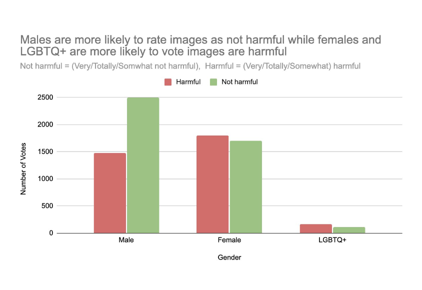
Males more likely to rate images not harmful; females and LGBTQ+ more likely to rate them harmful.
Finding 02 - Algorithmic literacy correlates with bias awareness
Users familiar with algorithmic systems were 94% aware of societal bias issues. Even users who were not familiar showed strong awareness (70%) - suggesting participation in auditing builds understanding regardless of prior knowledge.
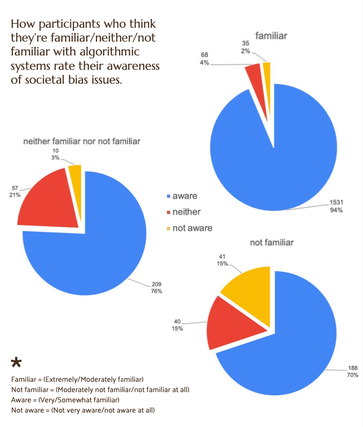
Familiar users: 94% aware · Neither familiar: 76% aware · Not familiar: 70% aware.
Finding 03 - Bias category affects sentiment differently
Sentiment scores varied significantly across bias categories. Sexuality-related prompts produced the highest scores (0.095), while gender bias prompts scored lowest (0.044) - revealing that different types of bias provoke different emotional responses in auditors.
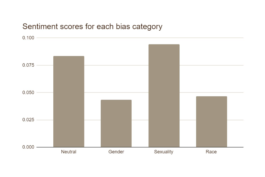
Sentiment scores: Neutral 0.084 · Gender 0.044 · Sexuality 0.095 · Race 0.047.
Diversity in the auditing crowd is a design problem
Who participates shapes what gets identified as bias. A platform designed only for technically-savvy users systematically underweights the perspectives of people who experience bias most directly. Broadening participation isn't just a community goal - it's a fairness requirement.
Evaluating TAIGA against Nielsen's 10 heuristics
Our team conducted a structured heuristic evaluation of the TAIGA platform, rating each of Nielsen's 10 usability heuristics by the number of follows and violations found - then weighting each by severity. The evaluation revealed a platform that handles system feedback and error prevention well, but struggles significantly with user control, consistency, and navigational clarity.
Visibility of System Status (+4)
Loading indicators, button feedback, and progress cues consistently inform users what the system is doing - including a "Generating from Stable Diffusion... Don't look away!" message with a loading circle while images generate.
User Control, Consistency, and Real-World Match (−2 each)
No way to undo a submitted post. Inconsistent button wording ("Create Thread" vs "+ New Thread"). Jargon like "Stable Diffusion" and "Google mode" unfamiliar to non-technical users. Two search bars with no explanation of the difference.
Six Prioritized Issues
Beyond the heuristic framework, we identified six specific usability issues rated by frequency, impact, and persistence.
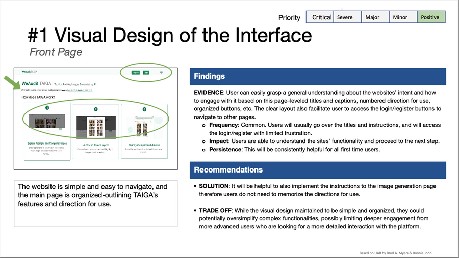
#1 Visual Design of the Interface
The front page is simple and easy to navigate - clear layout, organized buttons, and numbered directions help first-time users understand TAIGA's features and direction for use. Consistently helpful for new users.
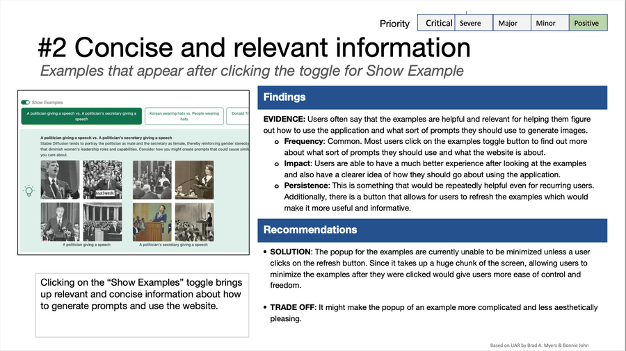
#2 Concise and Relevant Information
The "Show Example" toggle brings up relevant, concise prompt examples that help users understand what to generate. Common enough to have a significant impact on user experience, and easy to act on repeatedly.
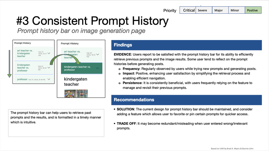
#3 Consistent Prompt History
The prompt history bar efficiently retrieves previous prompts and image results - formatted in a timely, intuitive manner. Users regularly rely on it while trying new prompts and generating posts, and can favorite or pin prompts for quicker access.
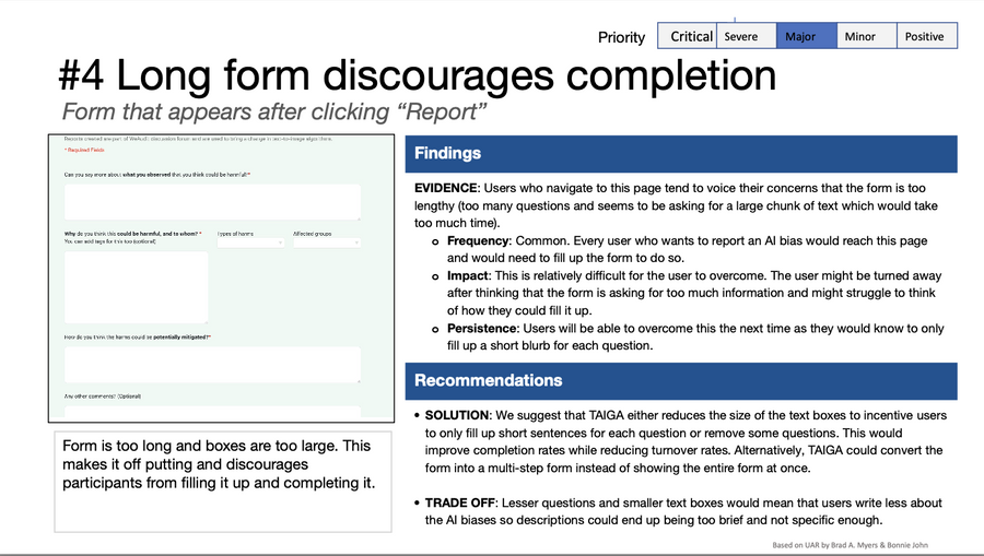
#4 Long Form Discourages Completion
The audit report form is too long and the text boxes are too large - users report feeling overwhelmed after thinking through too much information at once. Shortening text boxes or converting to a multi-step form would significantly improve completion rates.
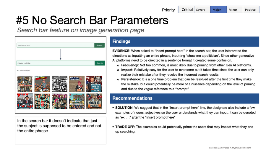
#5 No Search Bar Parameters
When asked to "insert prompt here," users interpret the directions as inputting an entire phrase like "show me politicians" - unaware that just the subject should be entered. Adding example adjectives or nouns after "Insert prompt here" would prime users on the correct format.
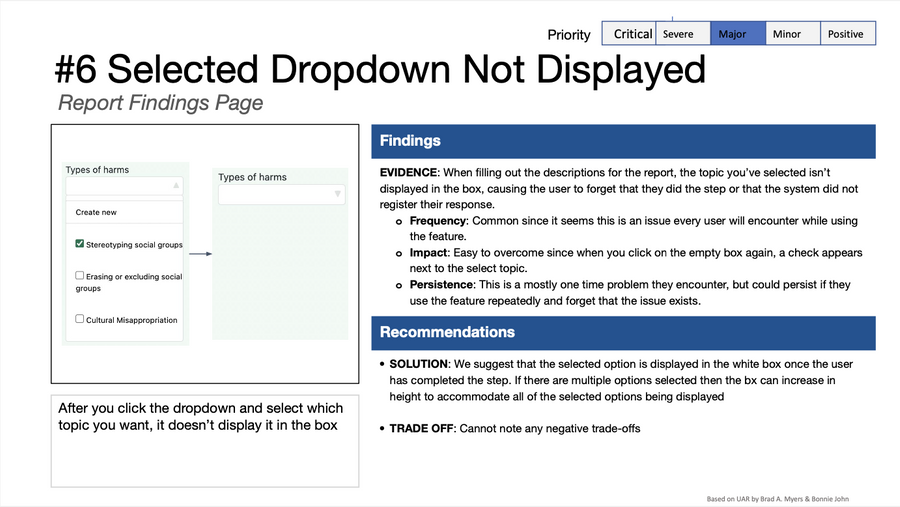
#6 Selected Dropdown Not Displayed
After selecting a "Types of harms" dropdown option, the selected value isn't shown in the box - causing users to think the system didn't register their response. Displaying the selected option in the white box would eliminate this persistent point of confusion.
Three directions for enhancing the TAIGA platform
We used a Why/How ladder to frame the design space across three strategic directions - each addressing a different root problem identified in the research.
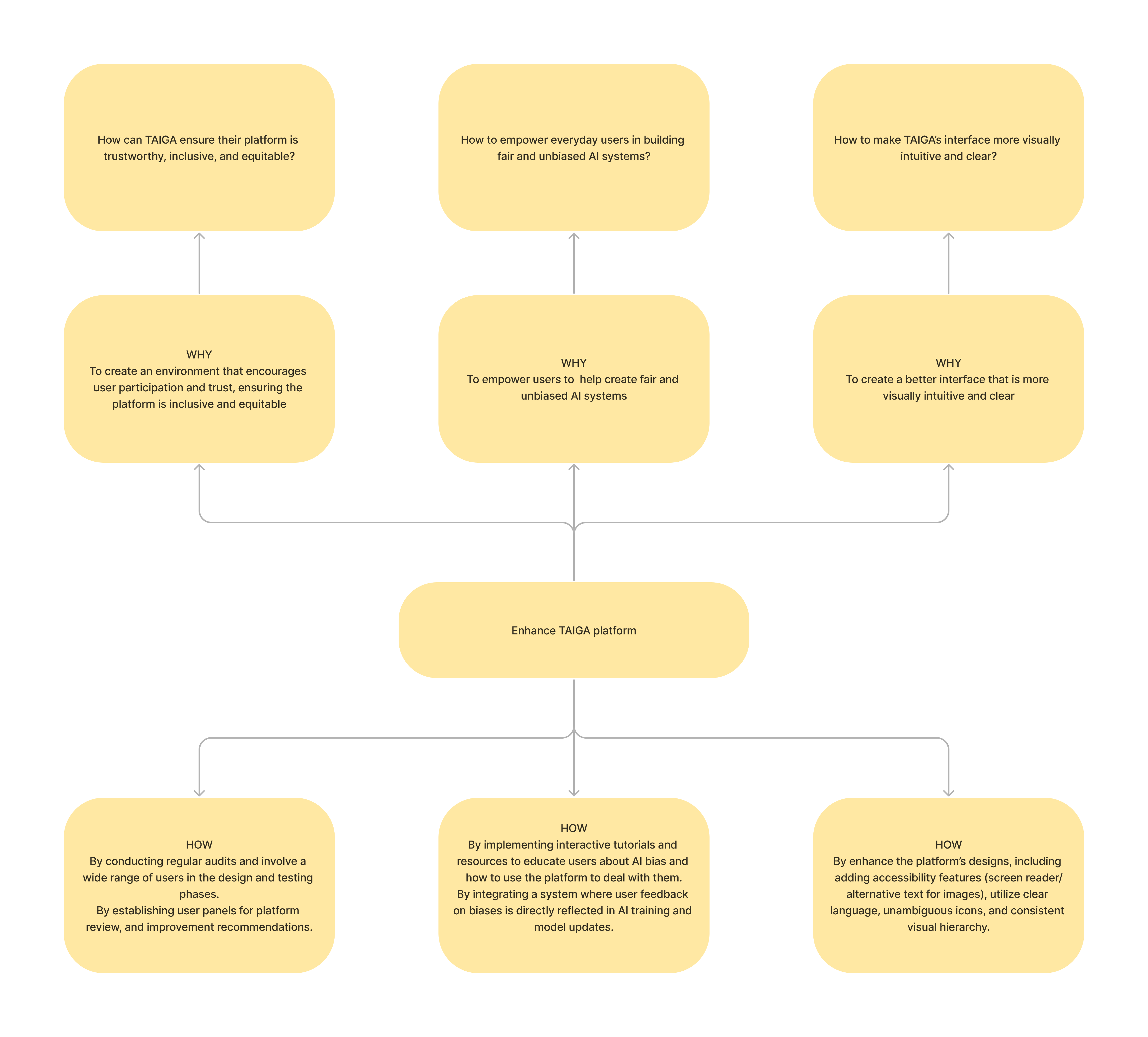
Why/How ladder: three directions for enhancing TAIGA - trust and inclusivity, user empowerment, and interface clarity.
Trustworthy, inclusive, equitable
Conduct regular audits and involve a wide range of users in design and testing phases. Establish user panels for platform review and improvement recommendations - making the platform itself accountable to the community it serves.
Empower everyday users
Implement interactive tutorials and resources that educate users about AI bias. Integrate a system where user feedback on biases is directly reflected in AI training and model updates - giving participants a visible stake in outcomes.
More visually intuitive and clear
Enhance platform design with accessibility features - screen reader support, alternative text for images, unambiguous icons, and consistent visual hierarchy. Lower the barrier to entry for users unfamiliar with algorithmic systems.
Crazy 8s - Forum Feature Sketches
We ran Crazy 8s ideation sessions focused on the forum and social engagement layer - the part of TAIGA where findings get shared, discussed, and built upon.
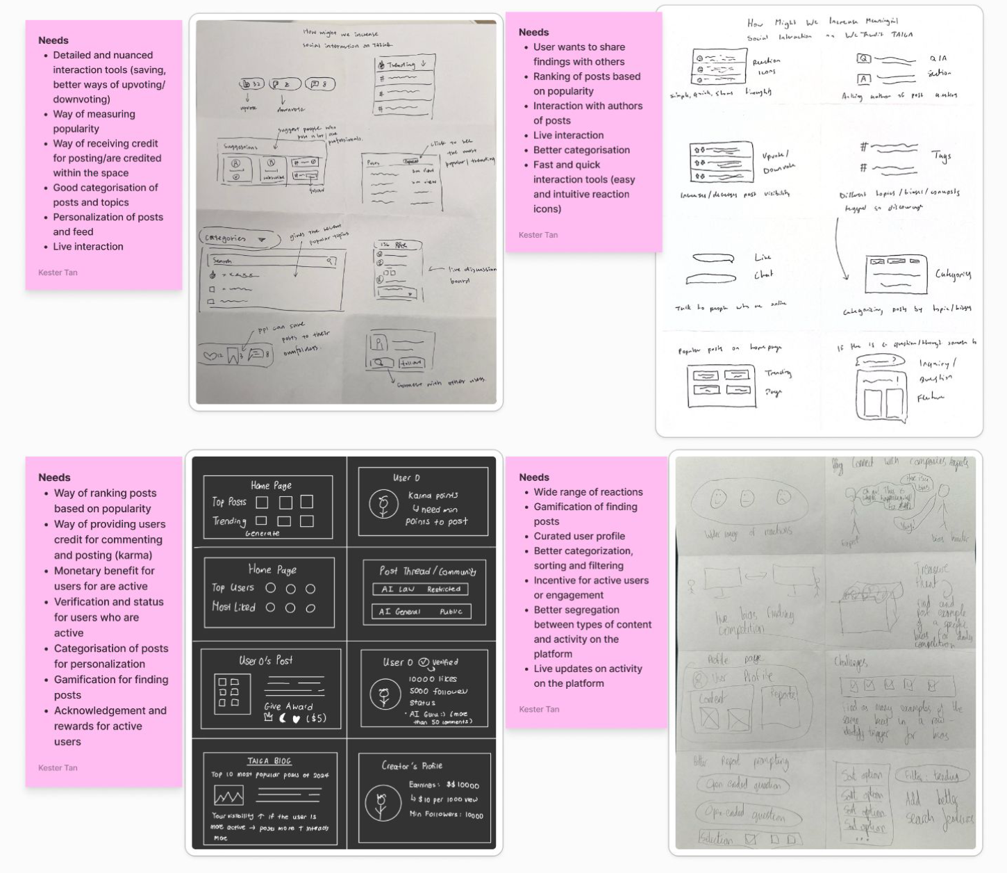
Crazy 8s sketches exploring richer forum interactions, live reactions, and content categorization.
Forum features that reward contribution and sustain engagement
The redesign focused on enriching the forum experience with features that give users more ways to interact with findings, recognize active contributors, and make participation feel meaningful over time.
Six Feature Areas
Live interaction
Real-time reactions on audit posts - hearts, thumbs up - making the forum feel active and responsive rather than static.
Share findings with others
Easy ways to highlight and share specific bias findings with the broader WeAudit community and beyond.
Recognition for active users
Visible indicators of contribution level - badges, levels, and audit counts - that acknowledge users who participate consistently.
Incentive to contribute
Rewards tied to participation quality - encouraging users to post findings, engage with others' reports, and return over time.
Nuanced interactions
More diverse interaction tools - save, upvote, downvote - giving users a fuller range of ways to signal agreement, disagreement, or interest.
Categorisation of posts
Tag and filter audit reports by bias type (gender, race, sexuality) so users can navigate findings by the areas most relevant to them.
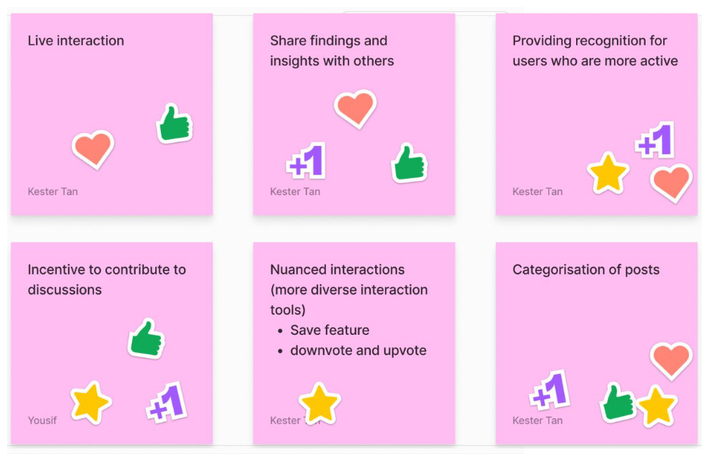
Six feature concept cards generated from Crazy 8s and research synthesis.
Gamification - Audit Bits and Quests
A lightweight gamification layer rewards audit quality through "Audit Bits" - an in-platform currency earned by finding biases that receive community upvotes. Users level up through auditing milestones and unlock quests like "Post 3 examples of gender bias in Meta's latest model."
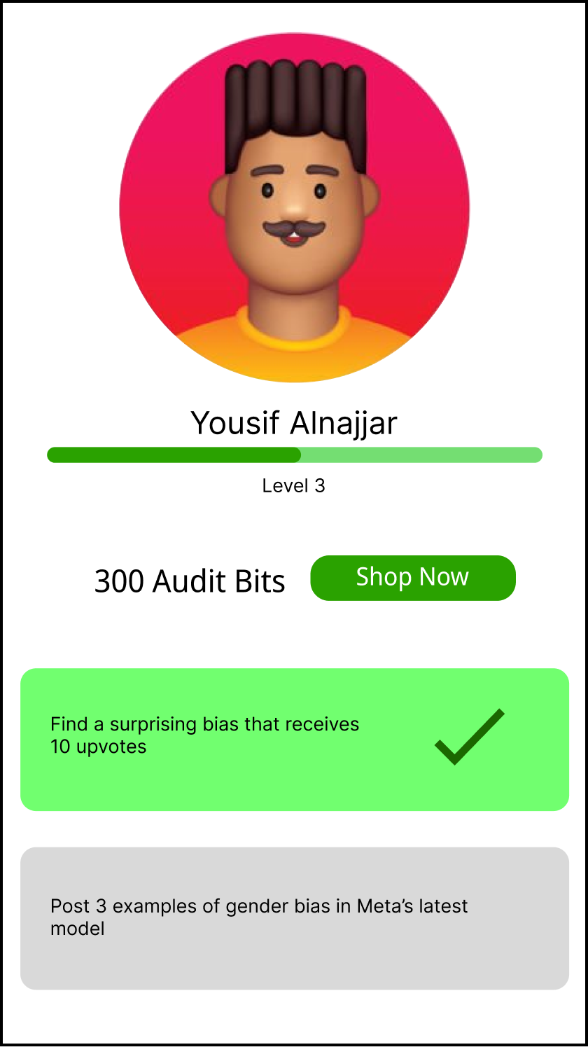
Profile screen: Level 3 user with 300 Audit Bits and active quests - completed and in-progress.
WeAudit forum
The parent WeAudit platform provides the community layer - a forum where audit reports become discussion threads, users follow topics, and findings accumulate into a shared knowledge base about AI bias patterns.
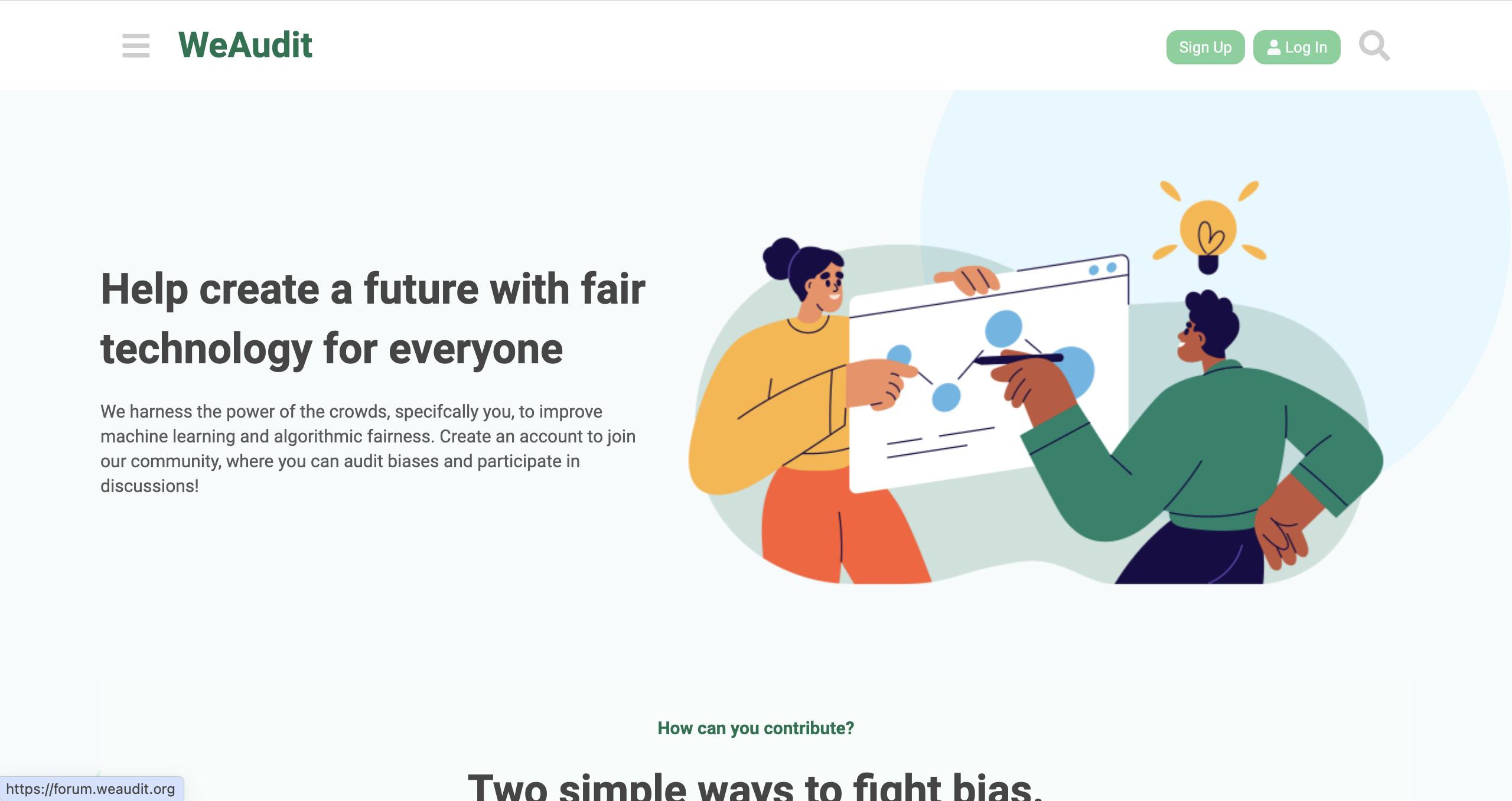
WeAudit forum: crowdsourced bias findings become community discussions.
Affinity Synthesis - Walking the Wall
 (2).png)
Module 5 deliverable: team affinity synthesis across participation, trust, interaction, and interface themes.