Tanbii
Redesigning the UX of a gamified carbon-tracking app - improving navigation, information architecture, and the carbon-logging flow so users can track their environmental impact without leaving the game.

A game about reducing carbon - where the UX was getting in the way.
Tanbii is a mobile game that gamifies carbon tracking. Players build and grow a virtual farm world by completing real-life sustainability tasks - reducing driving, eating less meat, lowering household energy use. The game rewards eco-friendly behavior with in-game resources and progression.
The problem: the carbon tracking experience was buried inside a complex navigation structure that felt disconnected from the game. Users struggled to find where to log emissions, couldn't tell what was synced, and the dashboard surfaced the wrong information for the moment they needed it. The goal was to redesign the navigation and carbon tracking flow without disrupting the core game loop.
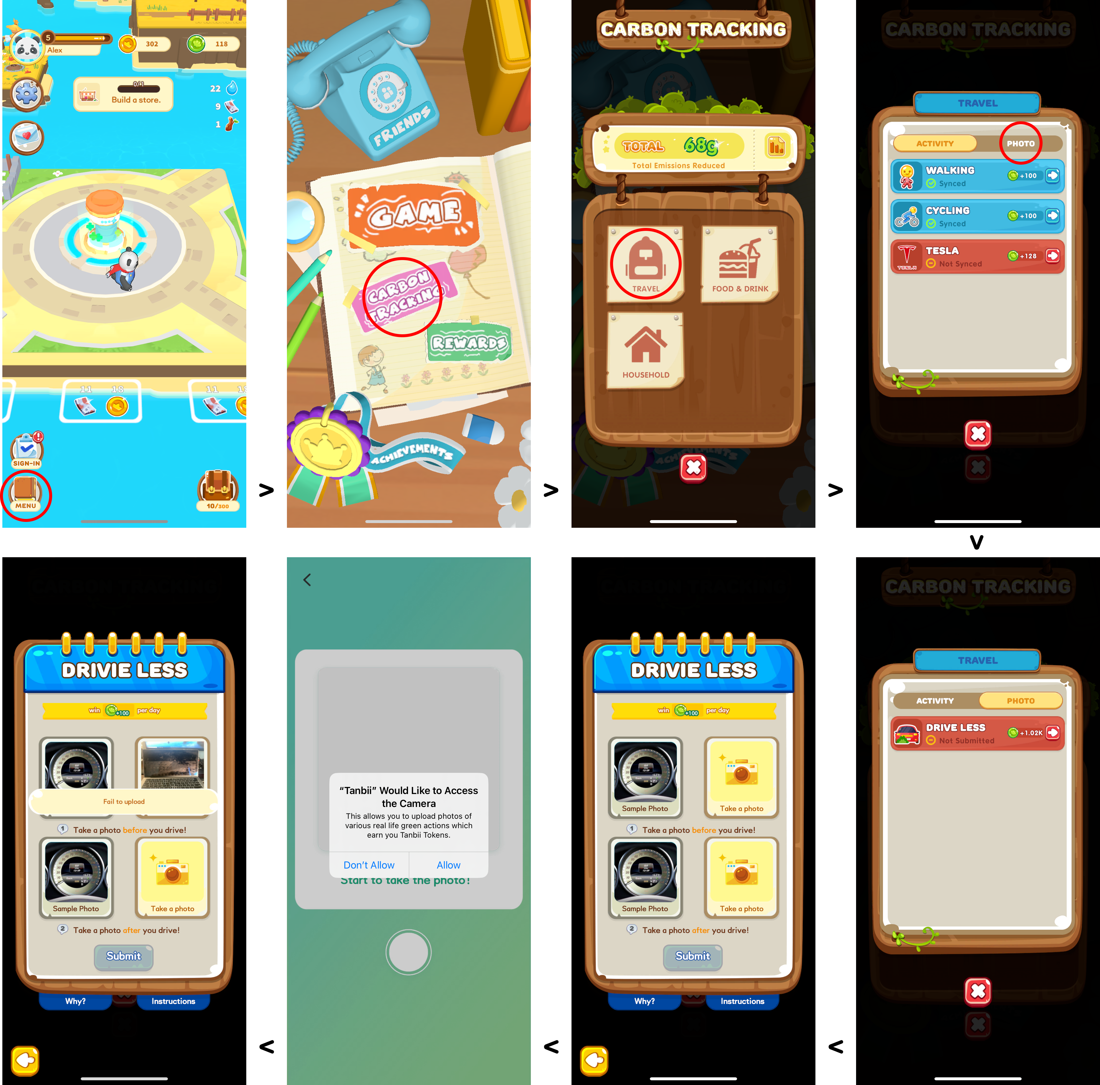
Original app screens: the farm game, the main game menu, the Carbon Tracking panel, and the Drive Less task flow.
Understanding what users actually need from the dashboard
We ran a card ranking study with 12 participants to understand which information users prioritized when opening the Energy Center dashboard - and what they could deprioritize.
Card Ranking Results - What Users Prioritize
Participants ranked 7 dashboard items by importance. Tasks came out on top by a clear margin - users wanted to see what to do next, not account or settings information.
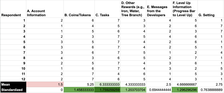
Raw card ranking data from 12 participants - standardized scores highlighted in green show Tasks, Coins, and Level Up as top priorities.
Prioritization Matrix
We mapped potential redesign areas by impact and feasibility to determine where to focus effort first.
 - uxchunks.com (Community) (3) 1.png)
Impact vs. feasibility matrix - User flow, Navigation, and Dashboard redesign clustered as high-feasibility priorities.
Tasks are the primary motivation for opening the app
Users ranked Tasks #1 by a wide margin. The existing dashboard buried tasks behind account and rewards information - the opposite of what users needed to see first.
Carbon tracking felt disconnected from the game
The Energy Center was nested two taps into the main menu and the tracking panel didn't clearly show sync status. Users couldn't tell whether their real-world actions had been counted.
Navigation had too many entry points and sub-menus
The main menu opened a layered sub-menu system. The user flow analysis showed unnecessary depth - users had to navigate through Game → Carbon Tracking → Energy Center just to log a task.
Account info and settings cluttered the most-used screen
Account information ranked last in the card study, yet took up prominent space in the UI. Deprioritizing it would free room for the content users actually came for.
Restructuring the navigation around what users actually need
The redesign focused on three areas: flattening navigation, surfacing carbon tracking at the top level, and redesigning the Energy Center dashboard to lead with tasks and progress.
Key Design Decisions
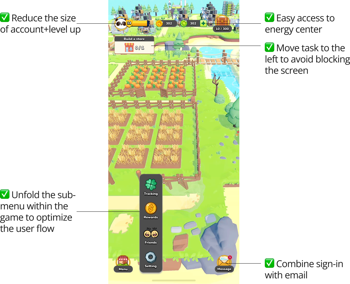
Redesigned main game screen - annotated with the five key structural changes applied to the layout.
Mapping the full redesigned user flow
The revised information architecture reduced navigation depth across every major path - from the game world to carbon tracking, rewards, leaderboard, and achievements. Numbered annotations trace the 8 primary user journeys through the redesigned flow.
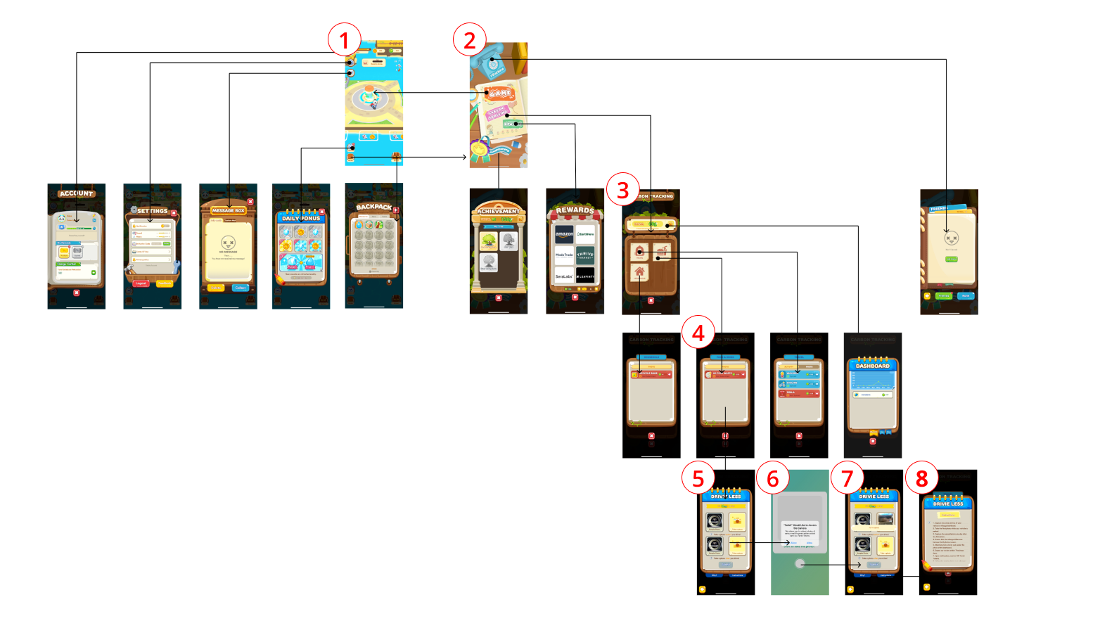
Full information architecture of the redesigned app - 8 primary flows mapped from the game world and game menu.
Energy Center and carbon tracking flows
The Energy Center redesign led with the tracking panel - showing sync status per activity (Walking, Cycling, Tesla) - and reorganized the dashboard to surface tasks and progress first.
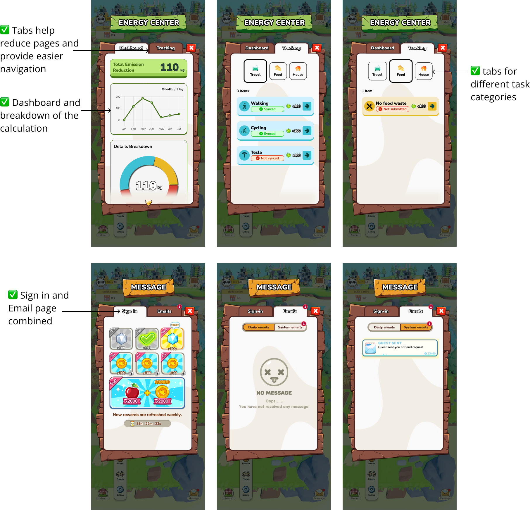
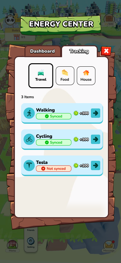
Left: Energy Center dashboard and tracking views, plus Message screens · Right: Tracking tab with per-activity sync status
Carbon tracking prototype flows
Two prototype videos walk through the full carbon tracking experience - from opening the game to logging an activity and seeing the reward update in real time.
Carbon tracking prototype flows - from task entry to sync confirmation and reward update